We’ve been working hard on WayAround: fine-tuning our tactile signage for testing, and developing the technology to audibly describe all the little details about the space immediately around you. We’ve also been having conversations with some key organizations that work with people who are blind. Progress is being made, and we’re getting closer every day to bringing WayAround to local restaurants, coffee shops, stores, schools, and buildings.
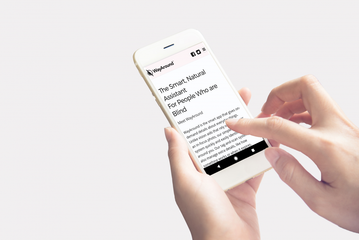
We’re all about making physical spaces more accessible, and today, we’d like to give you a glimpse into how we are making our virtual space more accessible. Our founders Darwin and Armand both use on-screen modifications to maximize their remaining vision. Armand often inverts the colors, and they both enlarge the font. Sometimes Armand uses a screen-reader. They give us valuable input about our website’s accessibility in terms of design and usability.
Before we publish something on WayAround.com, we run it through the WebAIM service to identify accessibility errors. We make the recommended fixes, yet even after we publish, sometimes we find things that make our site less-than-ideal in terms of accessibility.
We’ve started working with Colleen Connor to help us identify ways we can make our site even more accessible and intuitive for people who use screen readers. She made a video, where she gives us quite a few compliments about our site’s accessibility (aww, thanks). She also finds some things that just don’t work the way we thought they would!
We are sharing Colleen’s findings—both the good and the bad—for two reasons:
- If you’ve never used a screen reader, it’s a great intro to how they work.
- Creating good web accessibility isn’t a quick fix; it’s a journey. If you are committed to accessibility, even when you do your best, you almost always find there’s something more that could be done. WayAround isn’t just a great product (though it is that, if we do say so ourselves!). It’s also a way to open more conversations between people who are blind and people who aren’t. What is it really like to be blind? And how can sighted people be more engaging and less assuming about the experience of people who are blind?
Colleen’s work is part of our journey to better accessibility. We did some things well, and because we asked how to do better, she told us! And by the way, if you have suggestions for how our site can be more accessible, please tell our marketing director Jessica Hipp. Along with your suggestion, we’d love to know about your preferred settings, screen reader and browser.

